we.

Overview

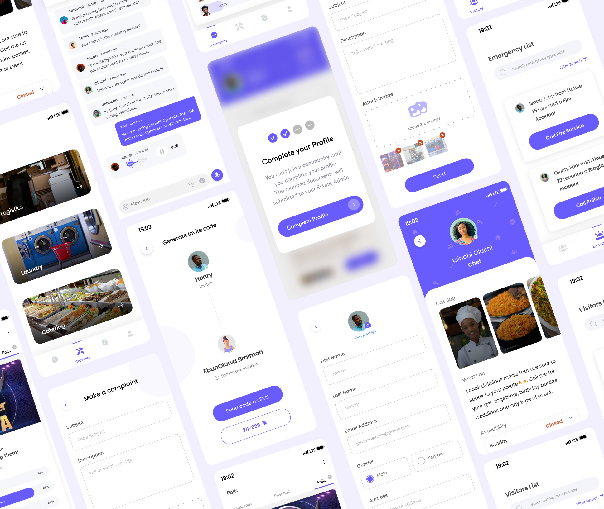
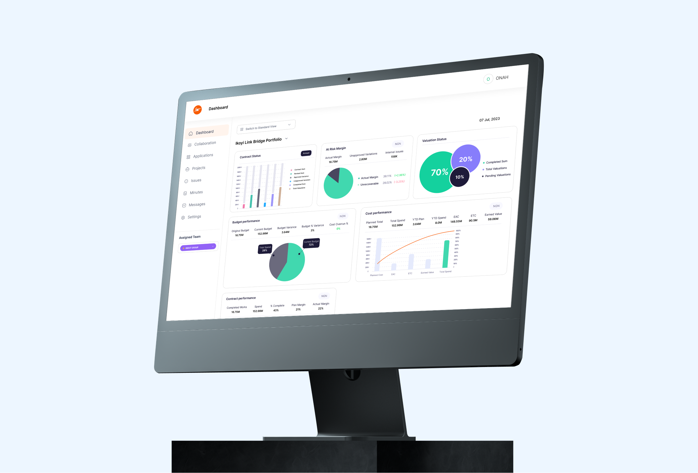
Our mission was clear: to craft a mobile app that would truly make a difference in the lives of those residing in exclusive neighborhoods. This wasn't just about technology; it was about enhancing the quality of life. Our solution comprised three key components—a members' app for residents, an admin dashboard for community administrators, and a dedicated app for vigilant security guards. To bring this vision to life, we embarked on an immersive journey of user research, meticulous wireframing, prototype development, and iterative design.
Problem Statement

Some context...


Nigeria, like many countries, has seen a significant rise in the development of gated communities and estates. These exclusive neighborhoods offer residents a sense of security and community. However, they often grapple with challenges related to communication and security management. Residents, community administrators, and security personnel face several pain points that highlight the necessity for a comprehensive solution.


The Challenges:

  • Communication Hurdles:
    Residents within gated communities often struggle with inefficient communication channels. Traditional methods like notice boards, phone calls, or in-person interactions prove to be slow and impractical, especially for urgent matters.
  • Access Control Complexity:
    Managing visitor access and security is a cumbersome process. Security personnel rely on paper records or rudimentary systems, leading to inefficiencies and potential security gaps.
  • Service Delivery Inefficiencies:
    Residents frequently require various services such as laundry, logistics, and catering. Coordinating these services can be challenging, leading to delays and frustrations.
  • Emergency Response:
    Security guards play a vital role in ensuring the safety of gated communities. However, they often lack efficient tools for handling emergencies, which can result in delays in critical situations.
  • Data Management:
    Community administrators struggle with managing resident profiles, security personnel information, and visitor logs efficiently. This leads to administrative inefficiencies and a lack of data-driven decision-making.

Competitive Analysis

Understanding the Competition


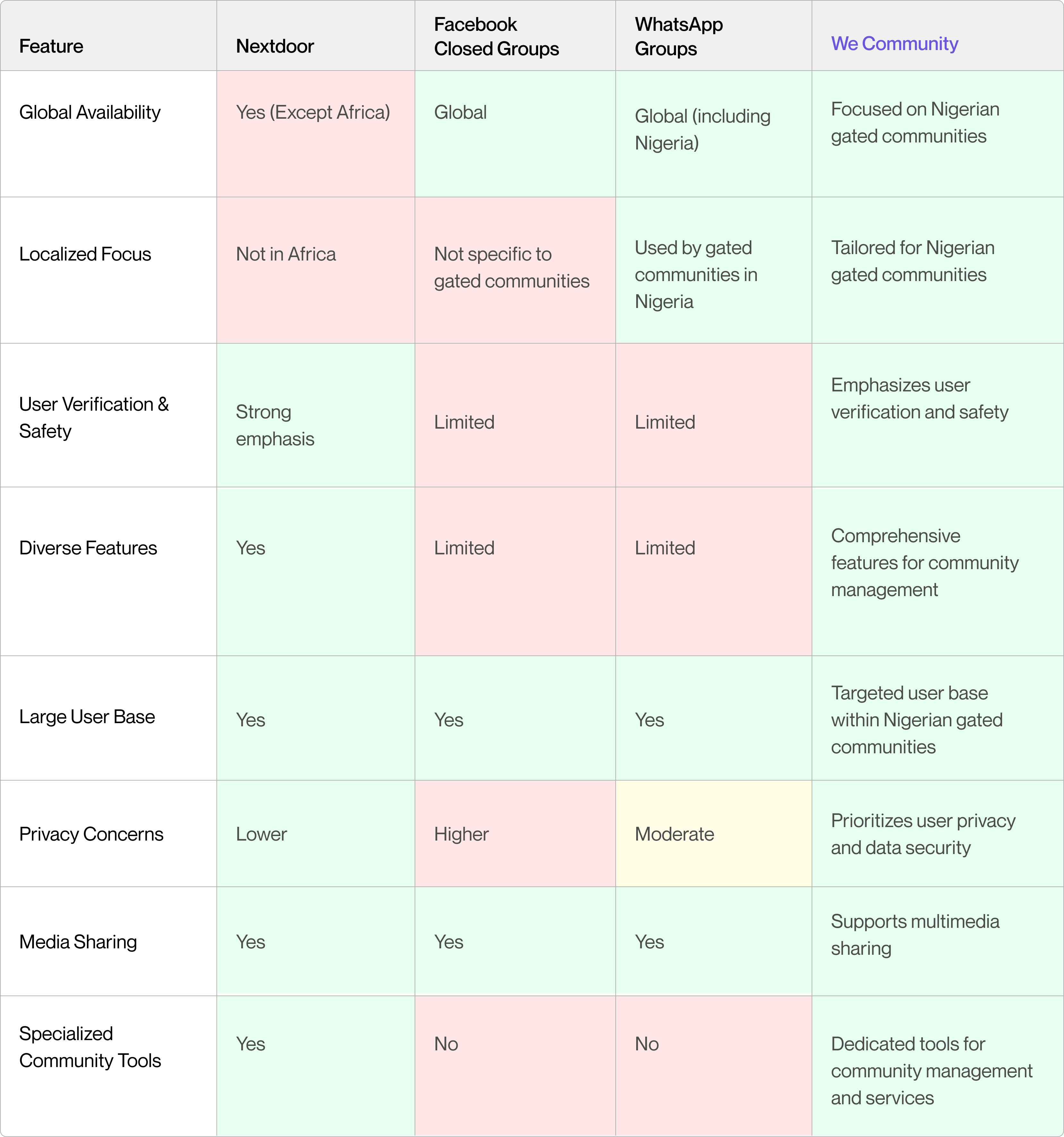
While designing we app, it was crucial to gain a comprehensive understanding of the competitive landscape. While our app is tailored for Nigerian gated communities, it's essential to acknowledge and analyze global and regional competitors to ensure our solution is both innovative and relevant. Our primary competitors in this context are Nextdoor (though it's not available in Africa), Facebook closed groups, and WhatsApp groups, which represent the most prevalent platforms for community communication and interaction. To better understand how we app stacks up against these competitors, we created a comparison table:

User Research

Getting to know our Users


In our quest to create we community, we delved into extensive user research. This phase was focused on understanding the needs, pain points, and perspectives of residents, community administrators, and security personnel.

  • Understanding Resident Needs:
    A thorough investigation was undertaken through interviews and surveys with residents to uncover pain points and gather requirements. Insights revealed residents' strong desire for improved communication channels, streamlined access control, and efficient service delivery within the community.
  • Administrator's Perspective:
    Engaging with community administrators provided essential insights into their challenges in managing residents and security personnel efficiently. Key findings indicated the need for simplified data management and streamlined processes.
  • Security Guard Insights:
    Conversations with security personnel helped understand their daily responsibilities and challenges. It became evident that the app should incorporate an emergency response feature to enhance safety and security.

Idea Validation

We were right!


Having proceeded to this phase with a clear understanding of user needs and pain points, it was time to validate our ideas. And guess what? We were right.
Here's what we did:👇🏽👇🏽

  • User Surveys:
    We conducted extensive user surveys within gated communities in Nigeria. These surveys aimed to gather insights into residents' communication habits, security concerns, and service delivery experiences. The overwhelming response indicated a strong need for an integrated solution that simplifies communication, enhances security, and streamlines service requests.
  • In-Depth Interviews:
    We conducted one-on-one interviews with residents, community administrators, and security personnel to gain a deeper understanding of their specific challenges and requirements. These interviews helped us uncover pain points related to communication inefficiencies, access control complexities, and the lack of dedicated community management tools.
  • Prototype Testing:
    To validate we's concept, we developed interactive prototypes and conducted usability testing sessions with potential users from gated communities. Their feedback and insights were instrumental in refining we's user interface, features, and overall user experience.
  • Collaboration with Community Leaders:
    We engaged with community leaders and administrators to discuss our proposed solution and gather their input. Their support and enthusiasm for the idea served as a strong validation of our concept's potential impact.

Design Highlights I

Pixels & Potions


Our design process was driven by a user-centric philosophy, ensuring the creation of a visually captivating, user-friendly, and highly functional mobile app. Here's a concise overview of our design journey:

  • User-Centered Approach:
    We meticulously crafted user personas and mapped out user flows to address the unique needs of residents, administrators, and security personnel.
  • Wireframing and Prototyping:
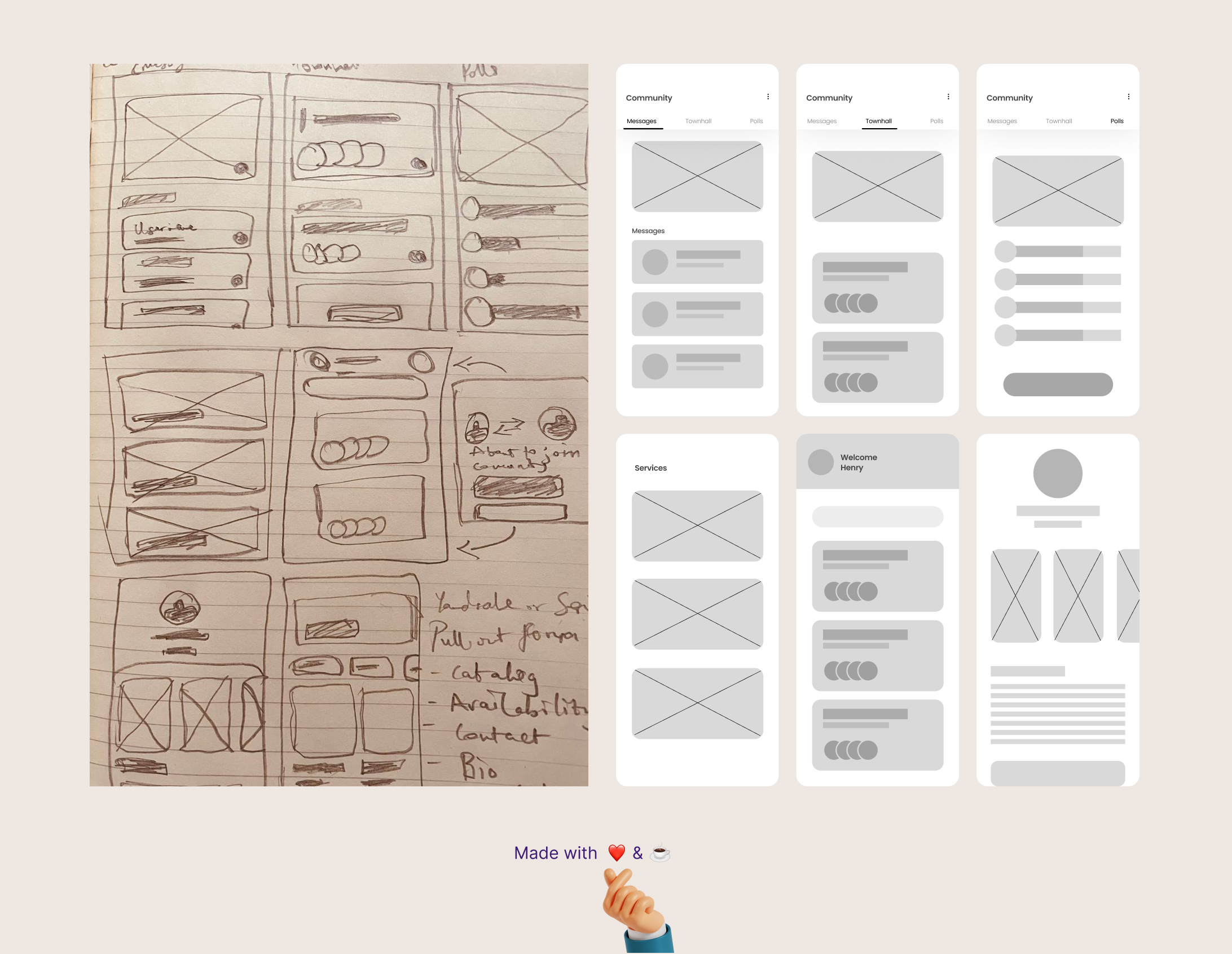
    Starting with low-fidelity wireframes, we gradually evolved our design through interactive prototypes, refining functionality and flow
  • Visual Identity:
    We selected a color palette, typography, created brand assets, therefore establishing a distinct brand identity that embodied trust and community spirit.
  • Clean UI Design:
    Our UI design prioritized simplicity and clarity, resulting in clean, intuitive and user-friendly screens.
  • User Testing and Iteration:
    We conducted usability testing with diverse user groups and iteratively improved the design based on their invaluable feedback.

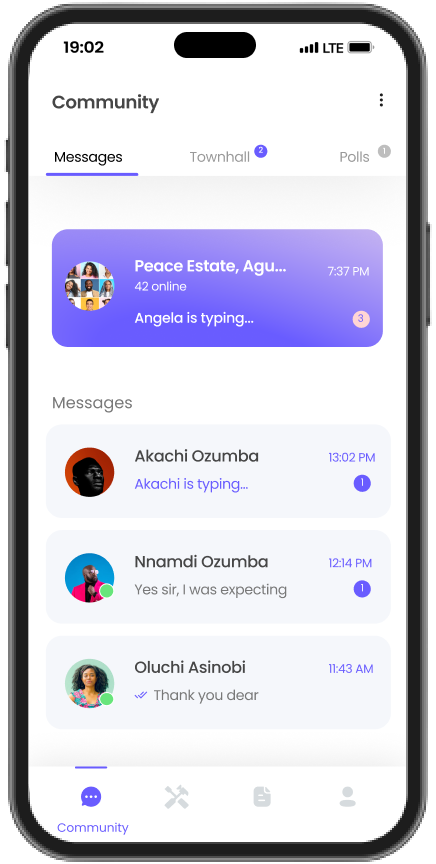
Our design journey reached its peak with a beautifully crafted and user-friendly mobile app that seamlessly combined what users wanted with a visually stunning experience. These snapshots from the app showcase the heart of our design process, giving Nigerian gated communities an app perfectly tailored to their unique needs and preferences.


Design Highlights II

Celebrating Diversity in Nigeria


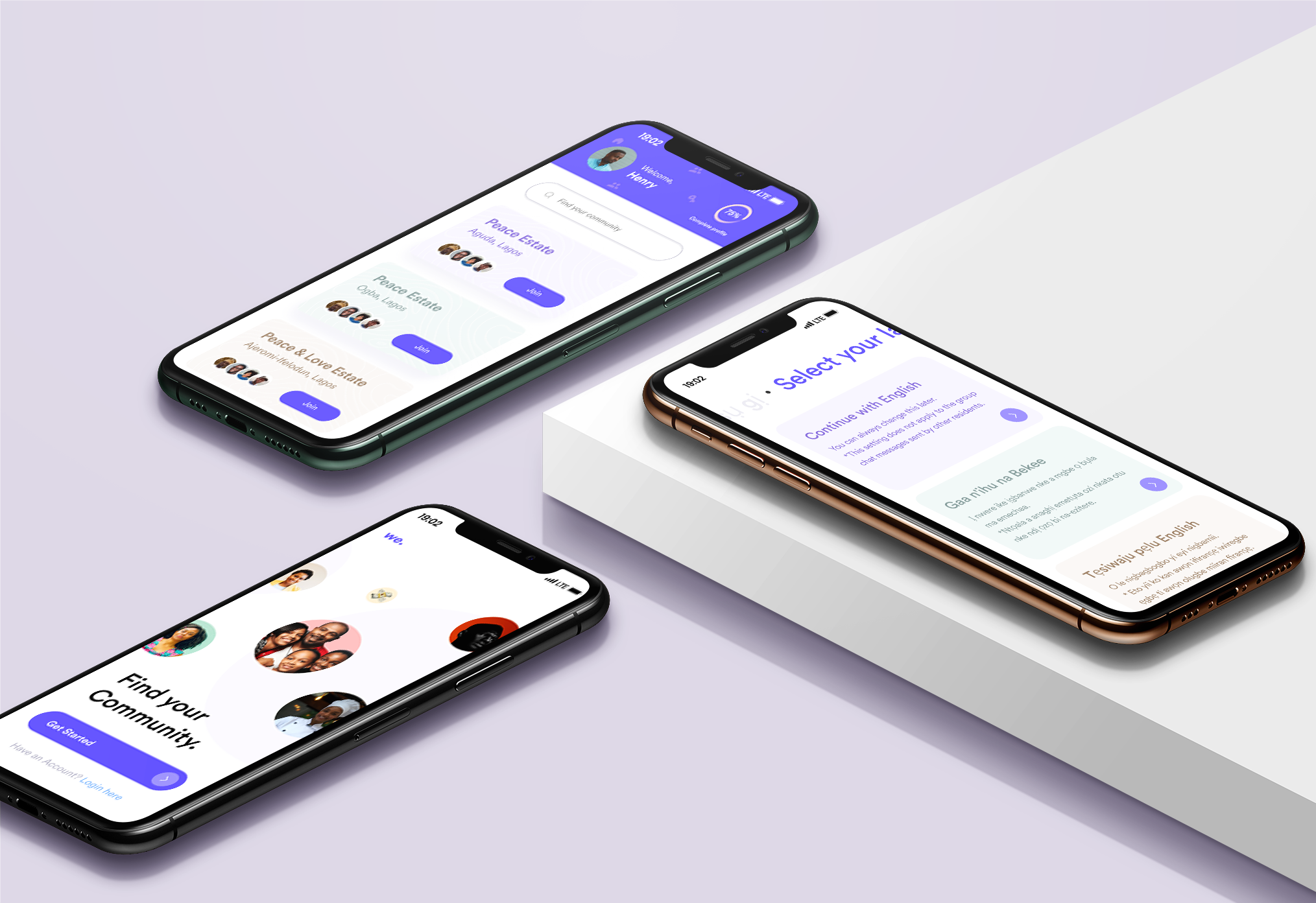
Our design journey was not only user-centric but also deeply inclusive. We recognized that Nigeria's diversity extends beyond geography to languages and cultures. Here's how we ensured our app welcomed and embraced this diversity:

  • Multilingual Support:
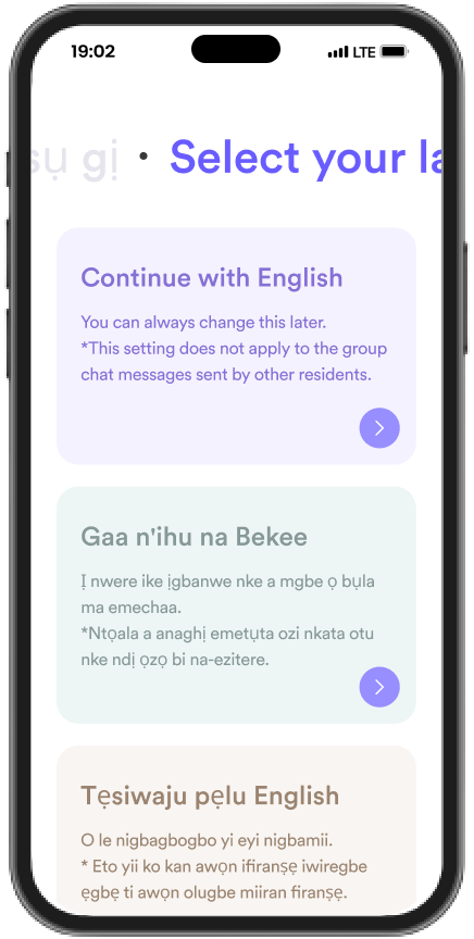
    Nigeria boasts three major ethnic groups—Igbo, Yoruba, and Hausa. To make our app truly accessible, we incorporated support for these languages, allowing users to engage comfortably in their preferred language.
  • Pidgin Integration:
    Recognizing the widespread use of Pidgin English as a unifying language, we integrated support for Pidgin throughout the app, enabling seamless communication for all.
  • Simplified UX Copy:
    We didn't stop at languages; we made sure that the entire user experience, from the interface to the copy, was in simple English grammar. This approach ensured that every user, regardless of their language proficiency, could navigate the app with ease.

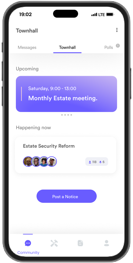
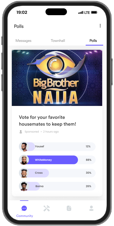
Our commitment to inclusivity and accessibility was woven into every aspect of the design, resulting in an app that not only functions seamlessly but also resonates with the rich tapestry of Nigeria's culture and languages. Here are some snapshots from the app:
Conclusion

*Fin*

This journey of empowering Nigerian gated communities with we has been a profound learning experience. Above all, it reinforced the idea that cookie-cutter solutions are inadequate when it comes to Nigeria's unique audience. The intricacies of communication, access control, service delivery, and emergency response demanded a tailored approach.

I learned that understanding the community's specific needs and preferences is paramount. The richness of Nigerian gated communities lies in their diversity, and our solution needed to reflect and embrace this diversity.

In conclusion, this endeavor has taught me that success in Nigeria's dynamic landscape requires not only innovation but also a deep appreciation of the audience's distinctiveness. It's a lesson I carry forward in my journey of creating impactful and locally relevant solutions.

Next Case Study